CryoFire
Web Design, 2019

SUMMARY
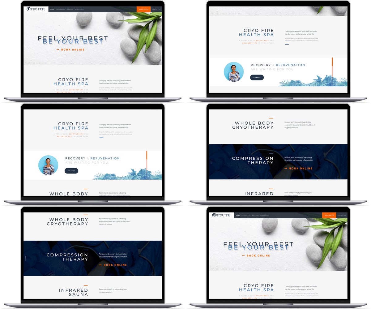
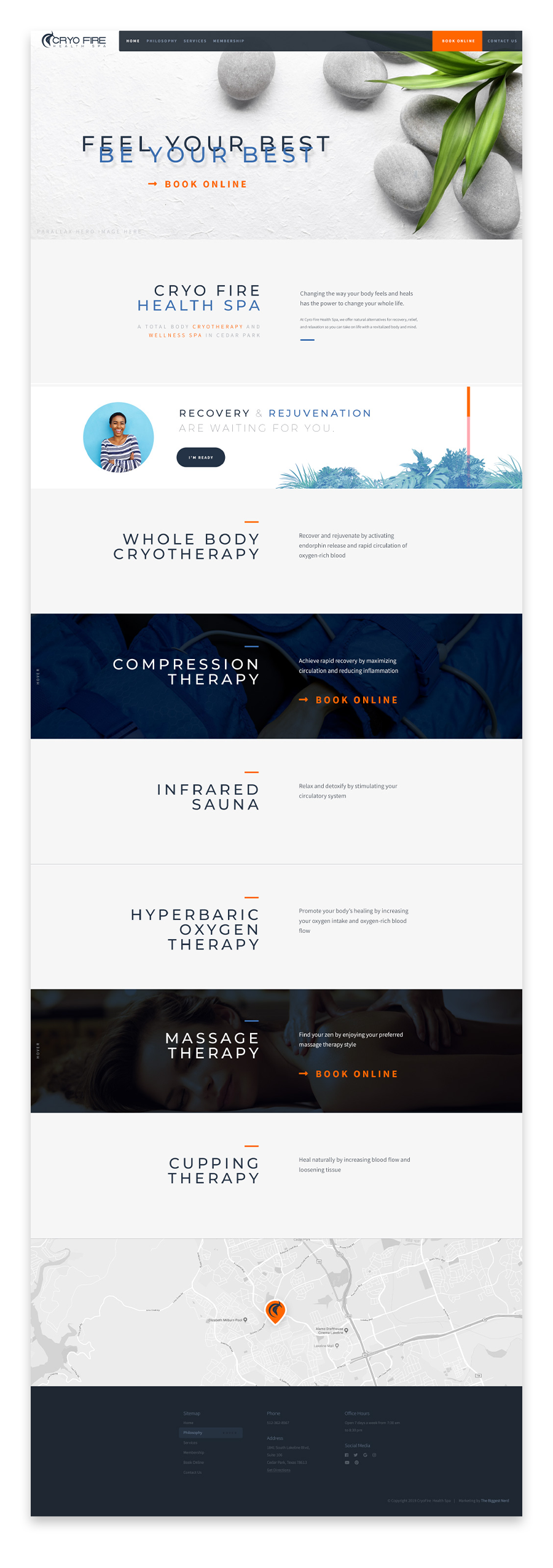
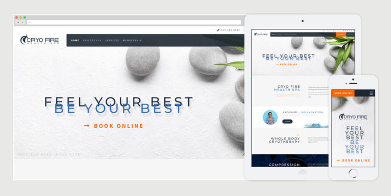
CryoFire expressed an interest in a minimal design I had created for another client, but wanted to emphasise the color contrast at play between hot and cold. All the while, keeping a spa-like feel. In the end, I cut a video together for their homepage you can see on the current iteration of their website.
Go to Site


